The family business Daniilidis Coffee Shop, after a history of more than half a century in the field of coffee and herbs culture, contacted us about a complete rework of their brand identity. The collaboration resulted in a brand new and more grown up visual identity, including a logo, illustrations, business card production, invoice, stickers and sign design.
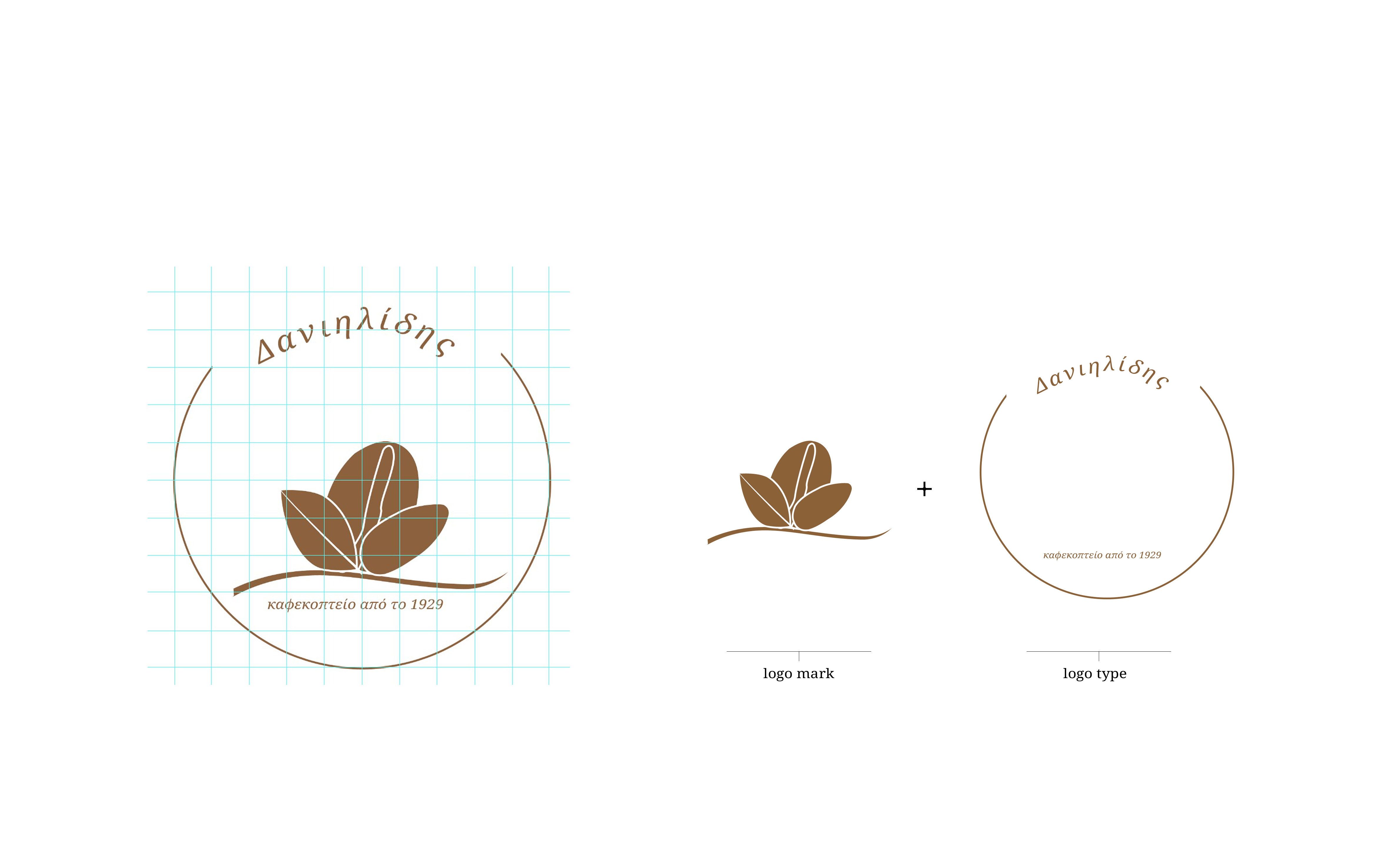
The Flower logotype went through many iterations where several different routes for the identity was explored. As soon as we decided to go into a more holistic approach we ended up a logo that illustrates the shop products’ in a unity. The logo comes from the composition of four elements that represent a flower blooming. These elements are a coffee bean, an almond, a bay leaf and a stick of vanilla. The primary element is the coffee bean as the characteristic of the business, so it is placed in the heart of the herbs shaping.
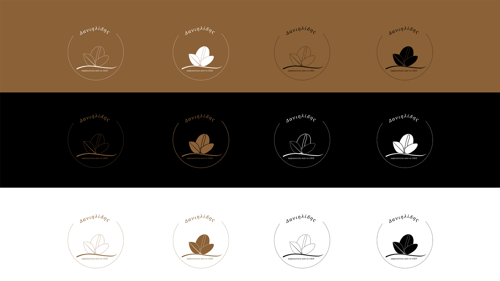
The color palette adapted was in a natural and earthy shade to represent the brand’s characteristics, so brown accents combined with dark grey and cream. We used a serif fonts that conveys discipline and timelessness.


