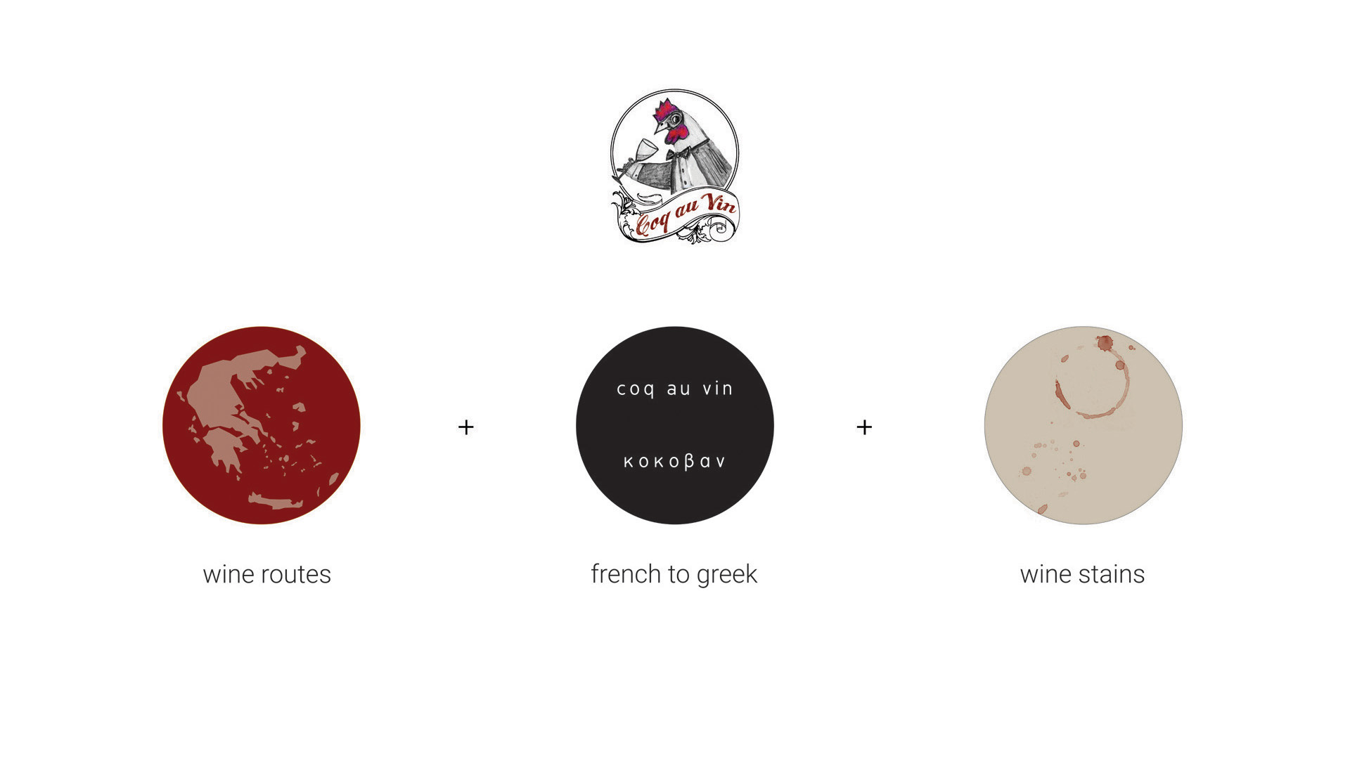
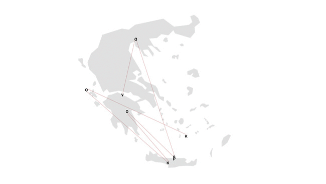
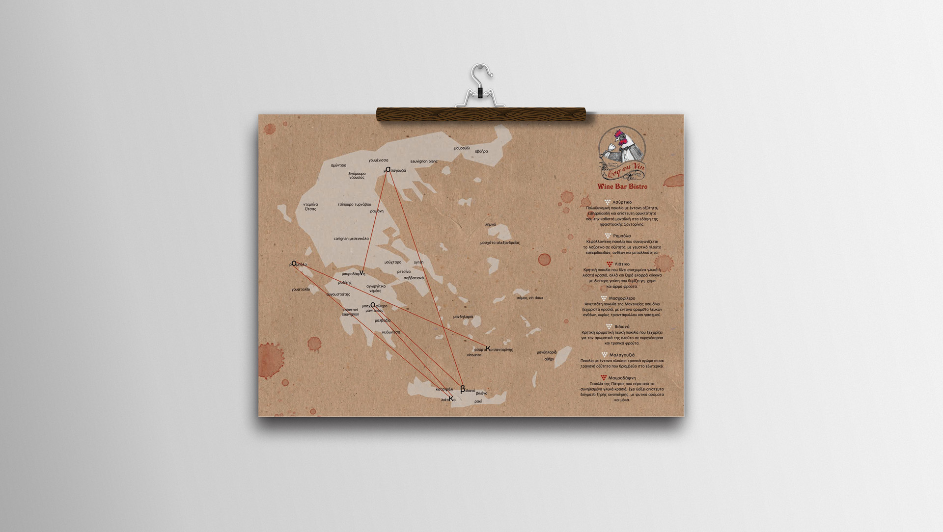
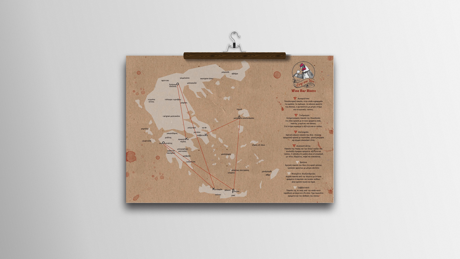
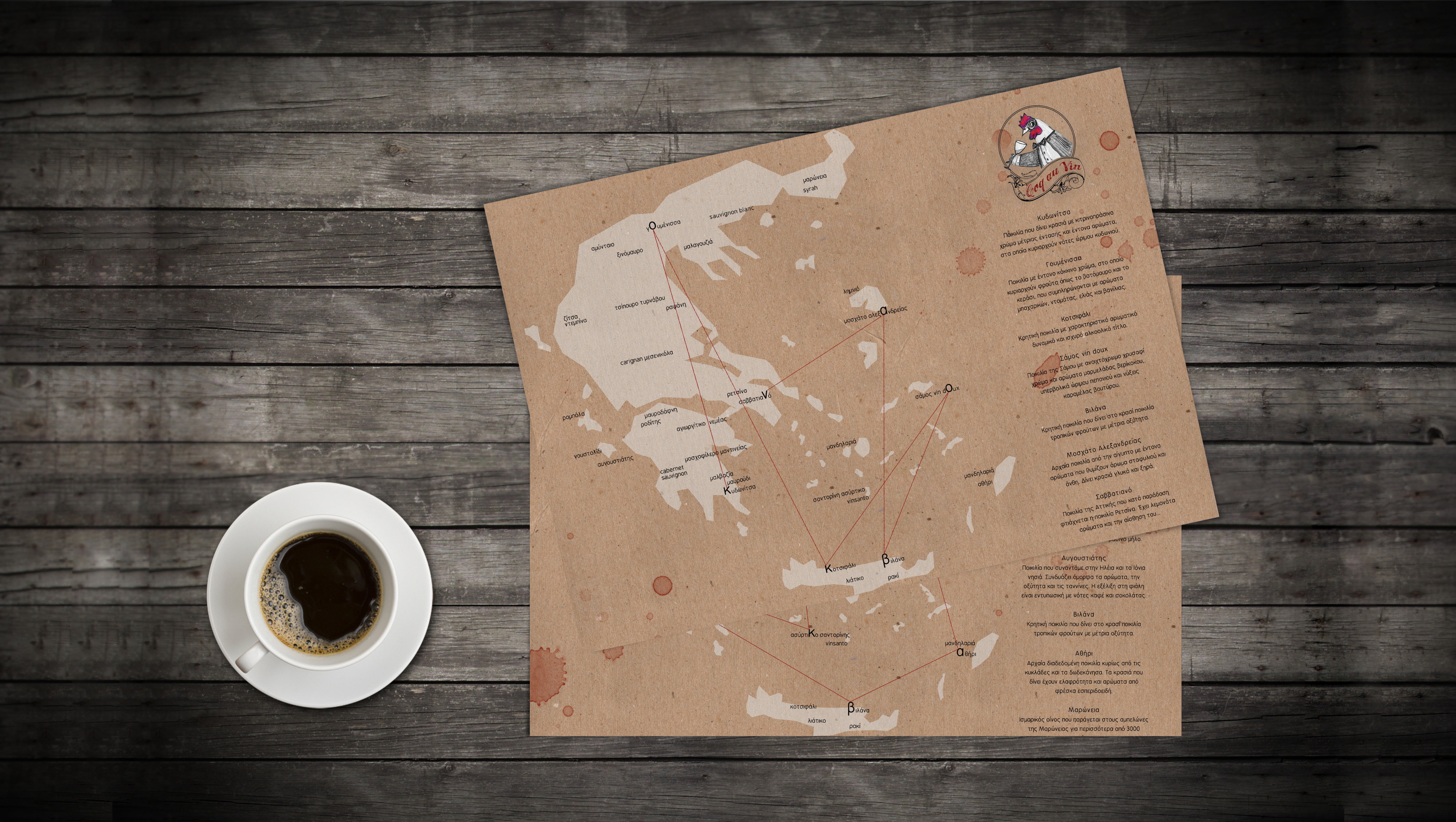
This project is about designing a catalog, placemats and a brochure for Coq Au Vin_ Wine Bar Bistro. The main objective was to focus on wine varieties, through a journey on the map of Greece. The French name of the restaurant Coq Au Vin, was transferred to Greek “κοκοβαν” and the wines’ varieties produced in Greece, were the staging points of traveler in the wine roads. Different letters from wines are nodal pathways forming the name of the restaurant. A kind of game then, guides everyone on the wine varieties.
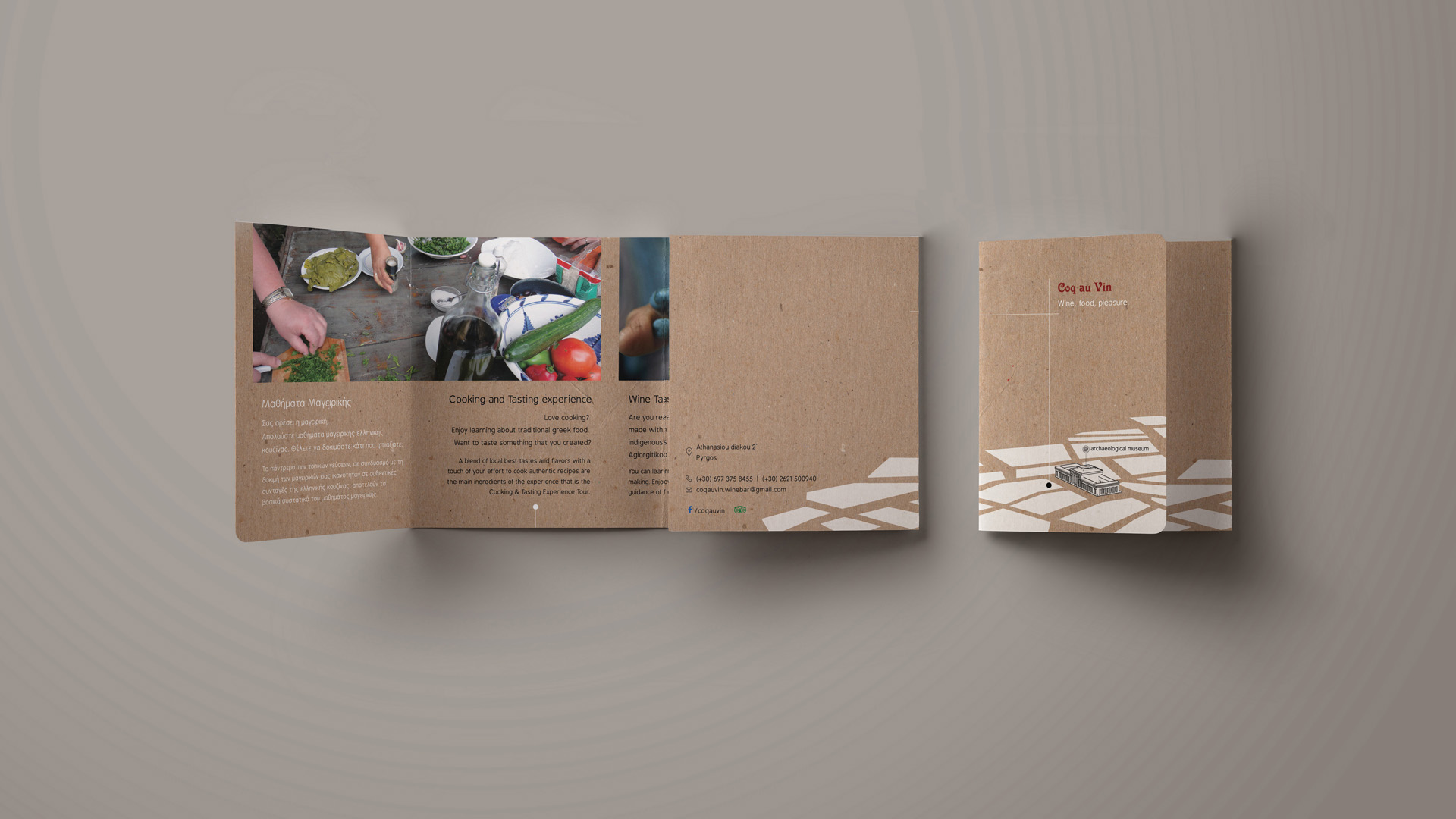
Particular emphasis is given to the location of the business, next to a landmark of Tower City, the Old Market. Therefore, we designed a map that highlights the interaction of the two elements, pulling the visitors to a test of cooking lessons and wine tasting.
Our aim was to express the owners’ style with a familiar, simple and humorous way, combining minimal typography, recyclable paper and warm colors. In the standard color palette adapted earth tones and deep red, inspired by patches of red wine as the traces of a pleasant taste experience.