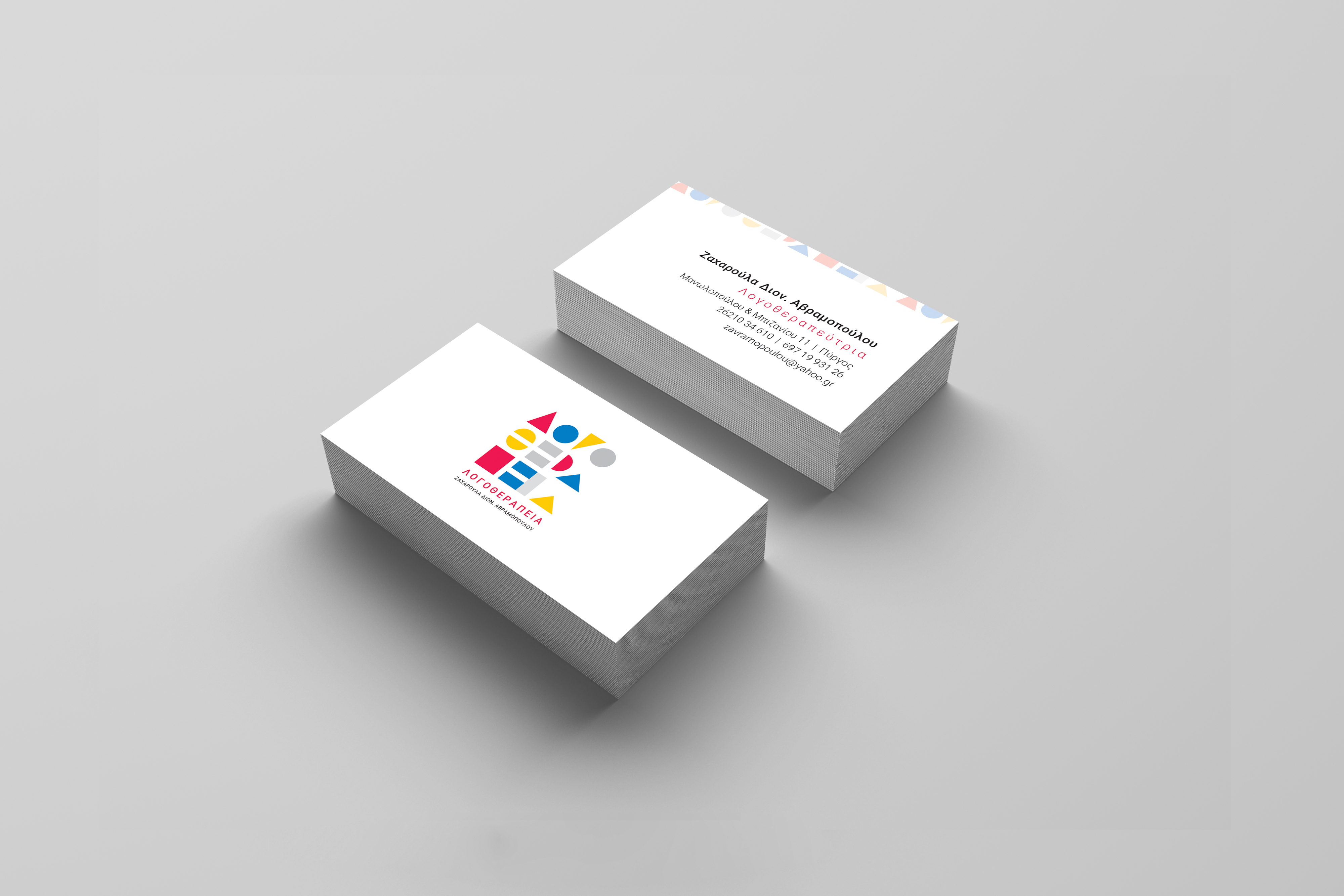
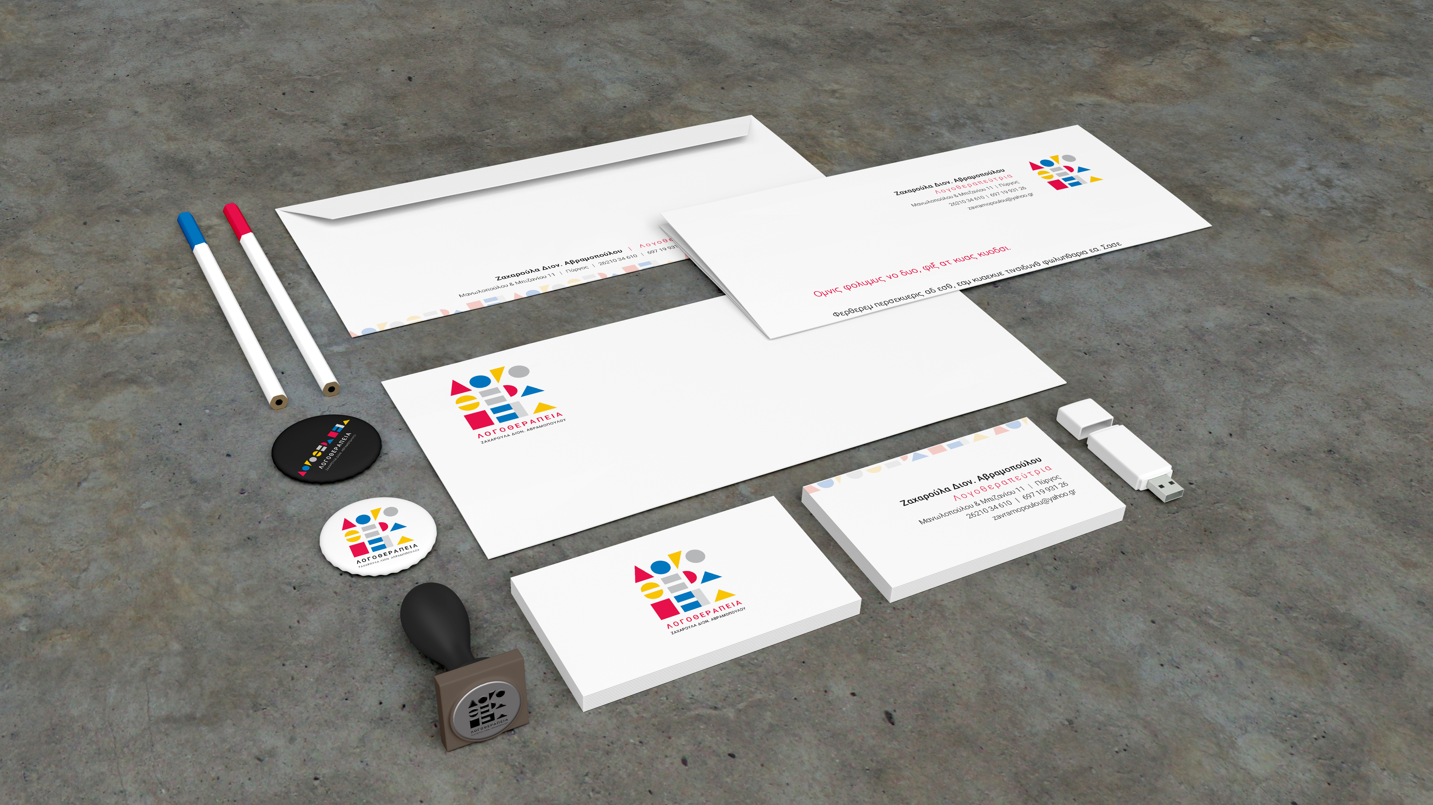
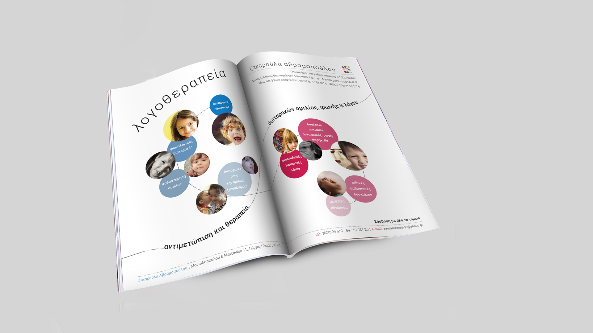
The project ZA Logotehrapist is a branding for a young speech therapist and includes a logo, illustrations, business card production, envelope-notepad, sign design and secondary elements.
The work of a logotherapist detects, identifies, gives treatment, monitoring and orientation to young patients in disorders, related to communication, voice, language and speech. For the young speech therapist, learning through play means creative child development. A means to it, which is strongly associated to childhood, are well known to everyone building blocks. There are plenty of its types on the market. It may be puzzles or jigsaws at different levels of difficulty. They can develop kids’ creativity and logic thinking simultaneously giving lots of fun to them and their parents.
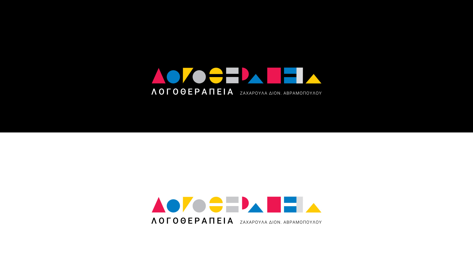
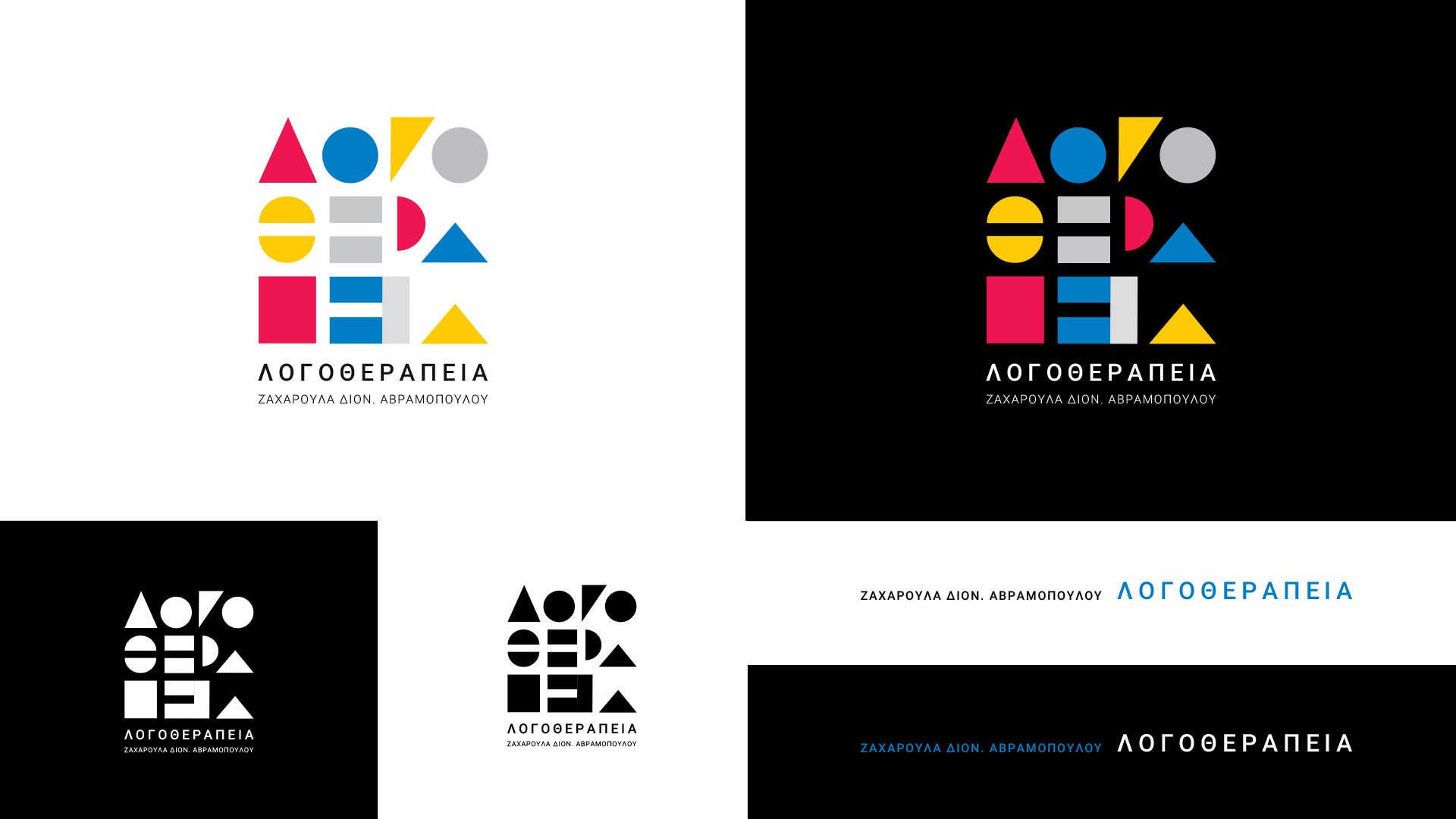
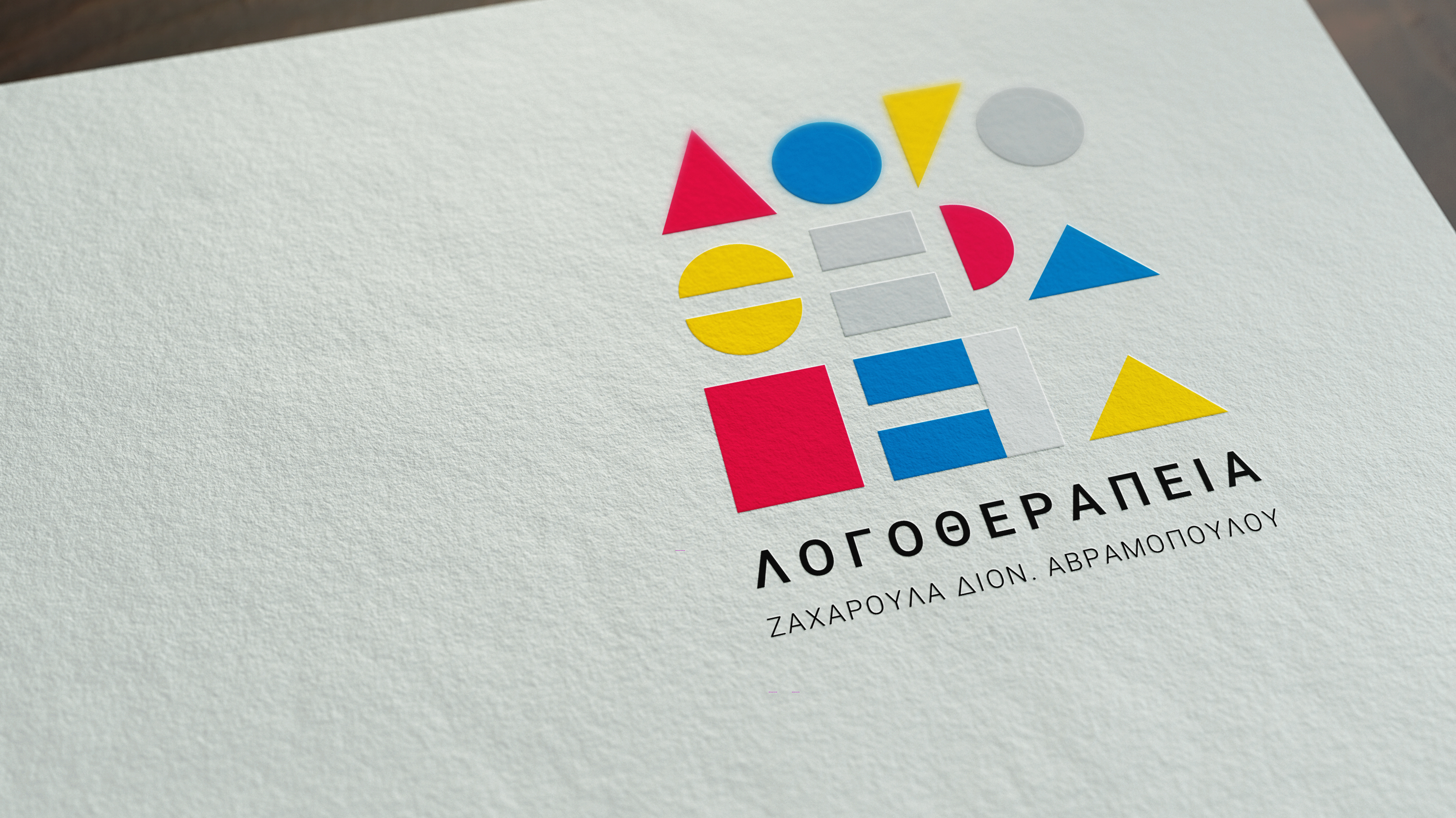
Primitive shapes are ‘the thing’ which we chose to be our inspiration for the whole corporate identity. Circle, rectangle and triangle shape the word “ΛΟΓΟΘΕΡΑΠΕΙΑ” trying to do a visual representation of what can be a speech for a child using primitive shapes. The color palette of the project is based on primitive colors too, blue, red, yellow in order to create a colorful and playful feeling.
