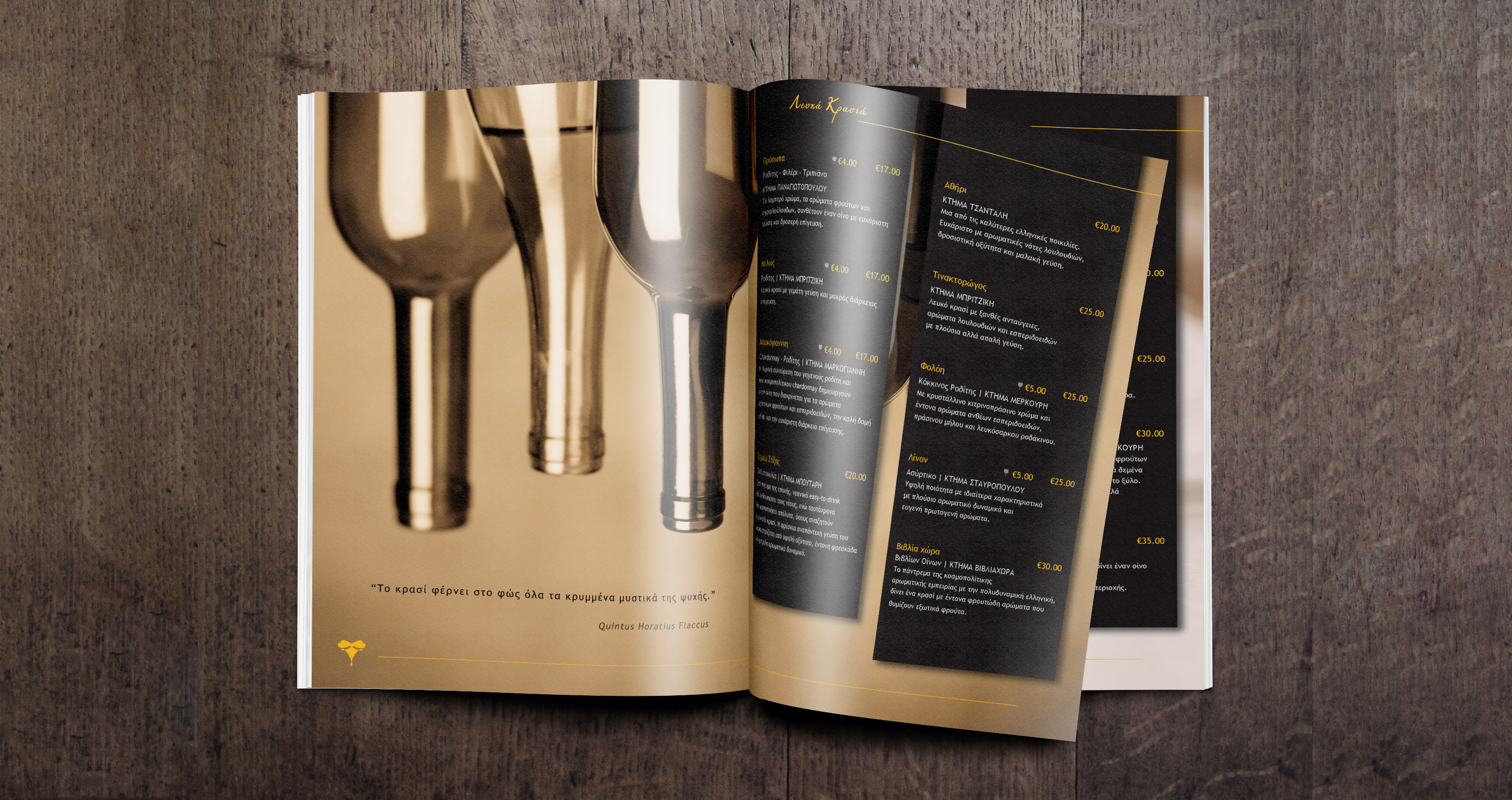
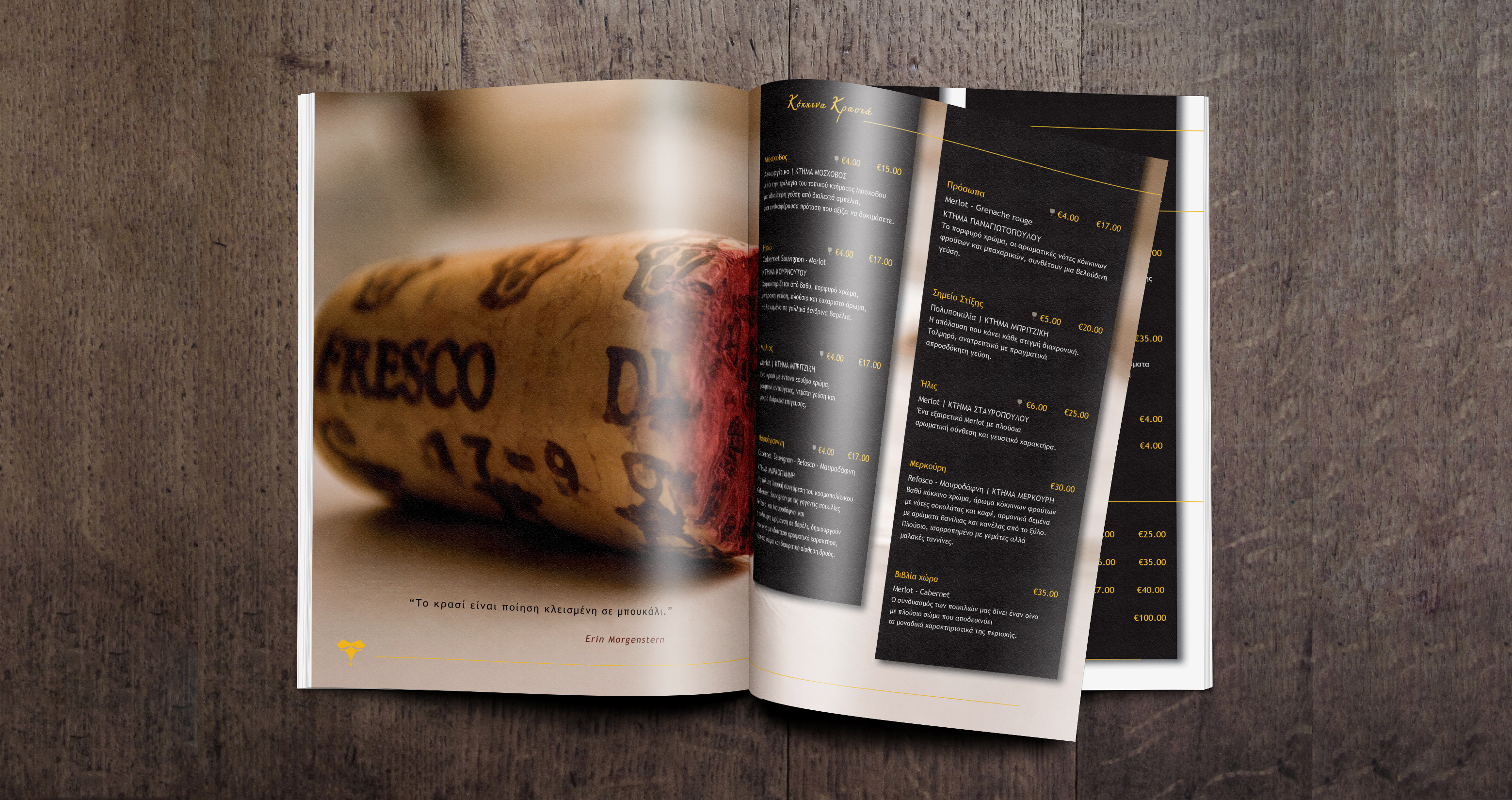
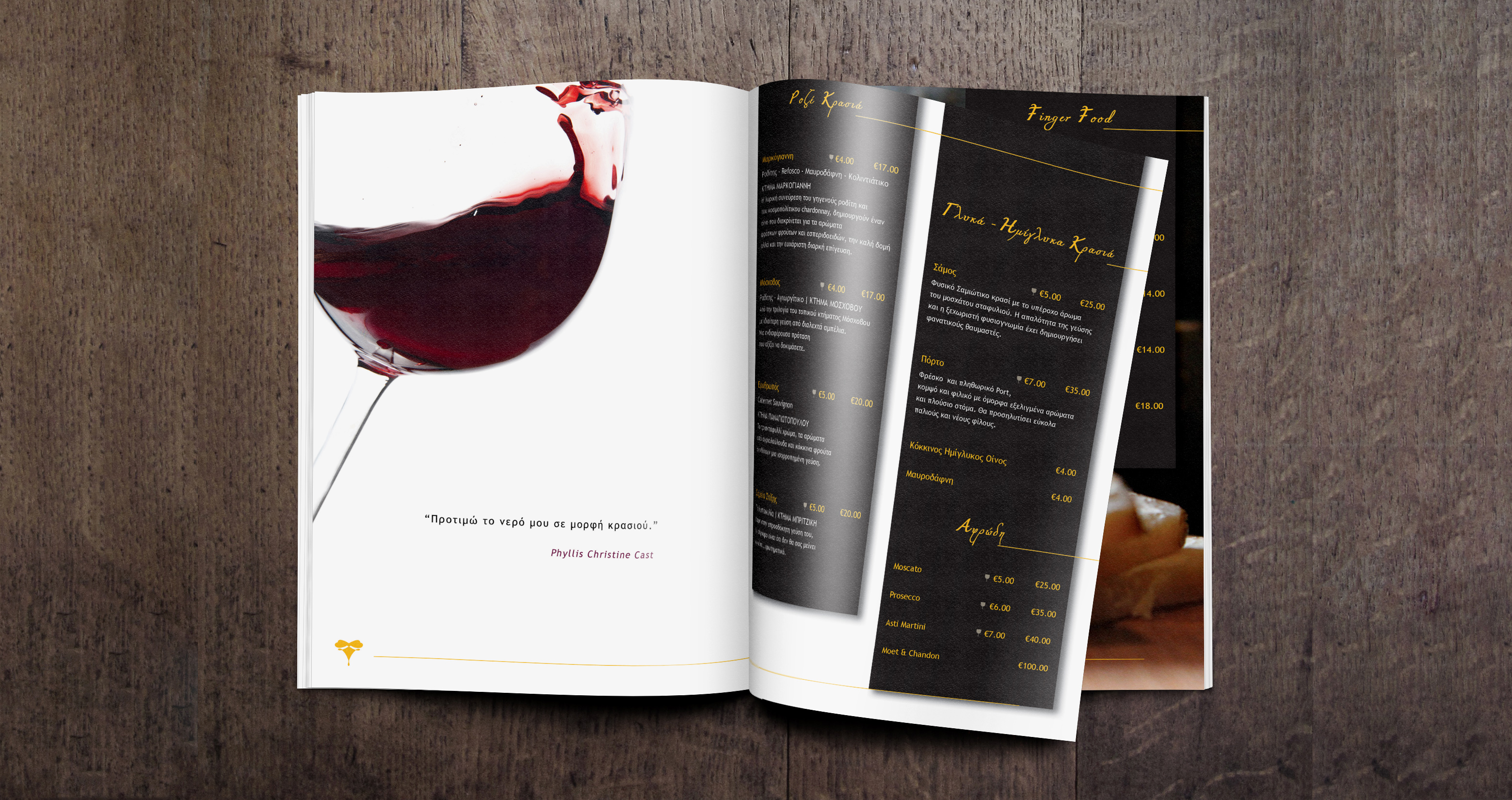
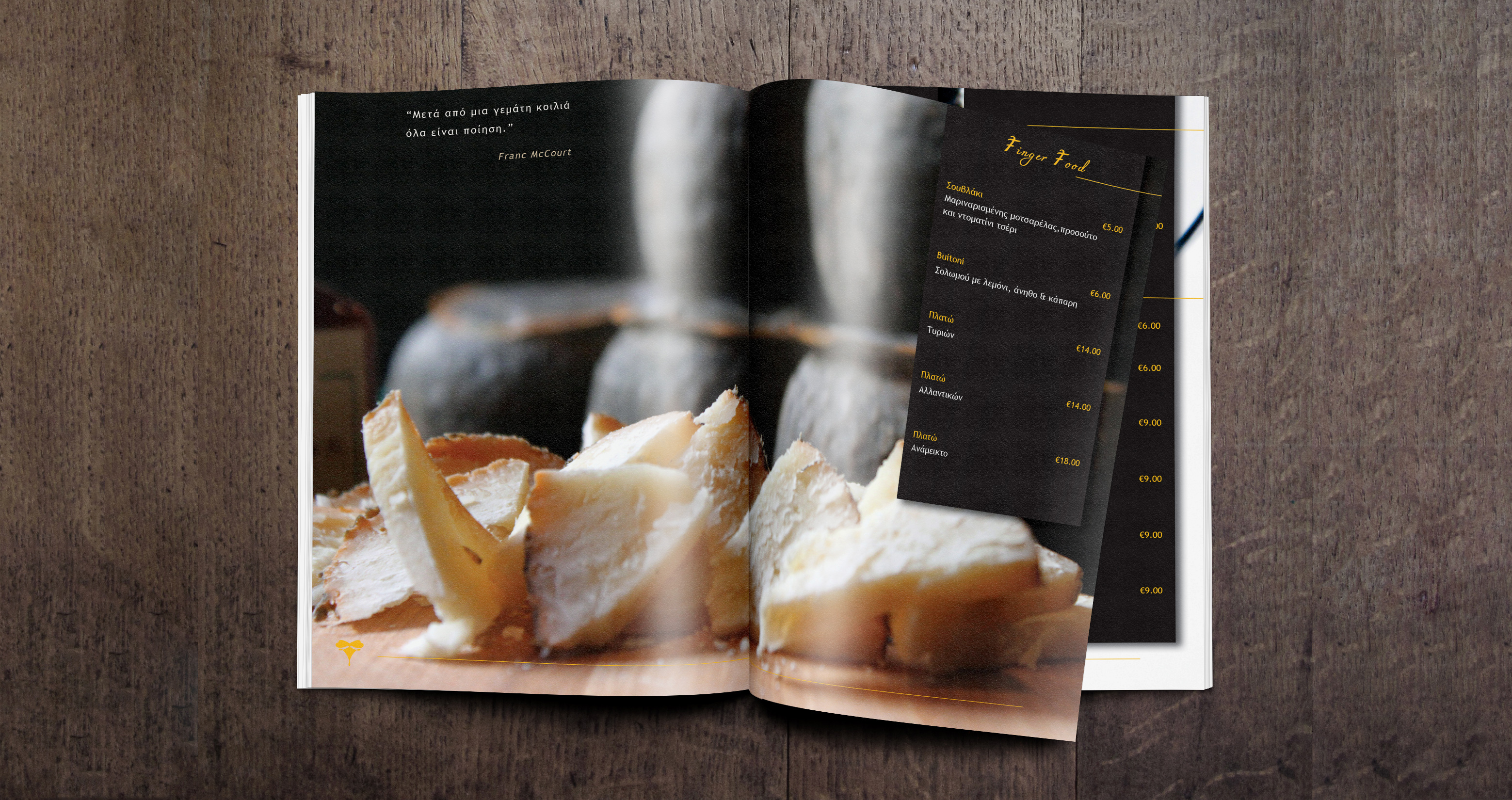
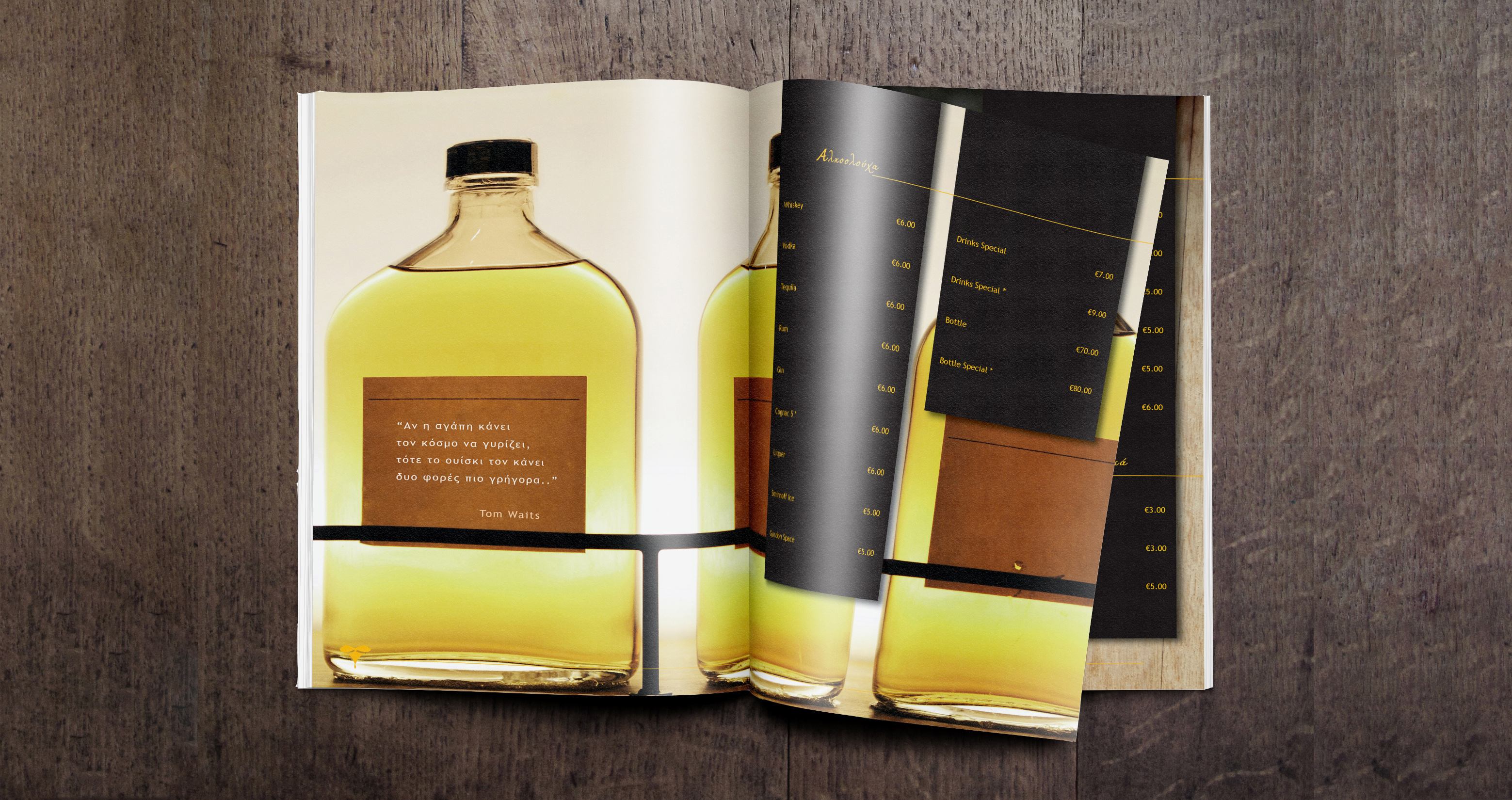
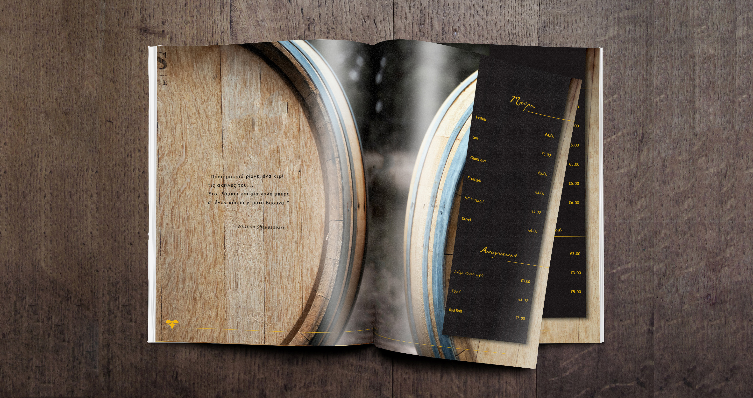
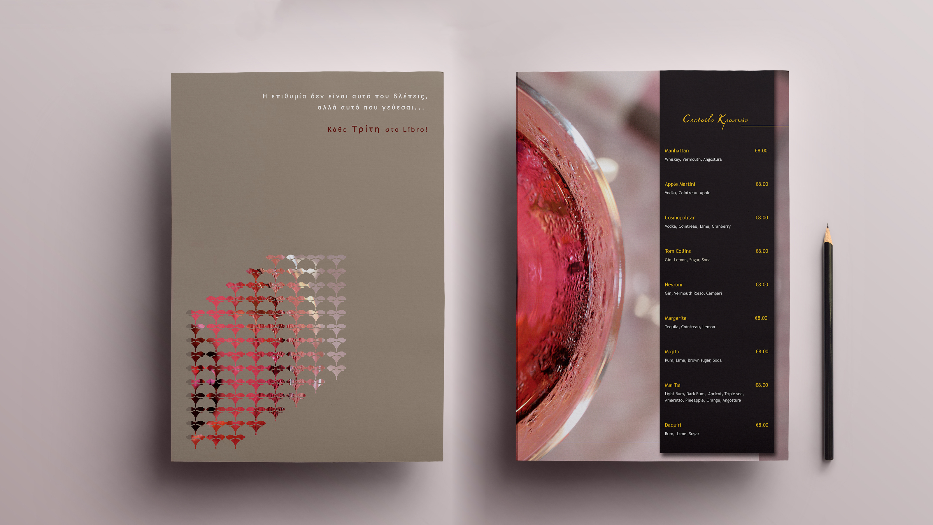
We were assigned by Libro Wine Bar to design its Catalogue. The design process was based on the business’ name so we designed a brochure that is thumbed as a book. Each category of the catalogue is presented on two pages with a characteristic photo that portrays a detail of the relative category. Lists of wines, fingers foods, cocktails are stripped down and presented in a visual language that completes the brand identity keeping the readers interest. A pleasant process is beginning when someone thumbs the pages of the catalogue, finding quotes on wine.
The right selection and editing of the photographic material was vital for the completion of the catalogue; using gold, black and white as the mains corporate colors, while denuding the pictures from unnecessary noise and giving them a particular style, they effectively stand next to the lists of wines without confusing the reader.
A minimal, yet fresh typography perfectly balanced with the high contrast of the calligraphic one which is used in the title of each category, facilitate the reader. The combination of typography, image, and printing technologies aimed at creating a finely detailed result, by demonstrating the prestige of the wine bar.
Have a more detailed look through the online brochure