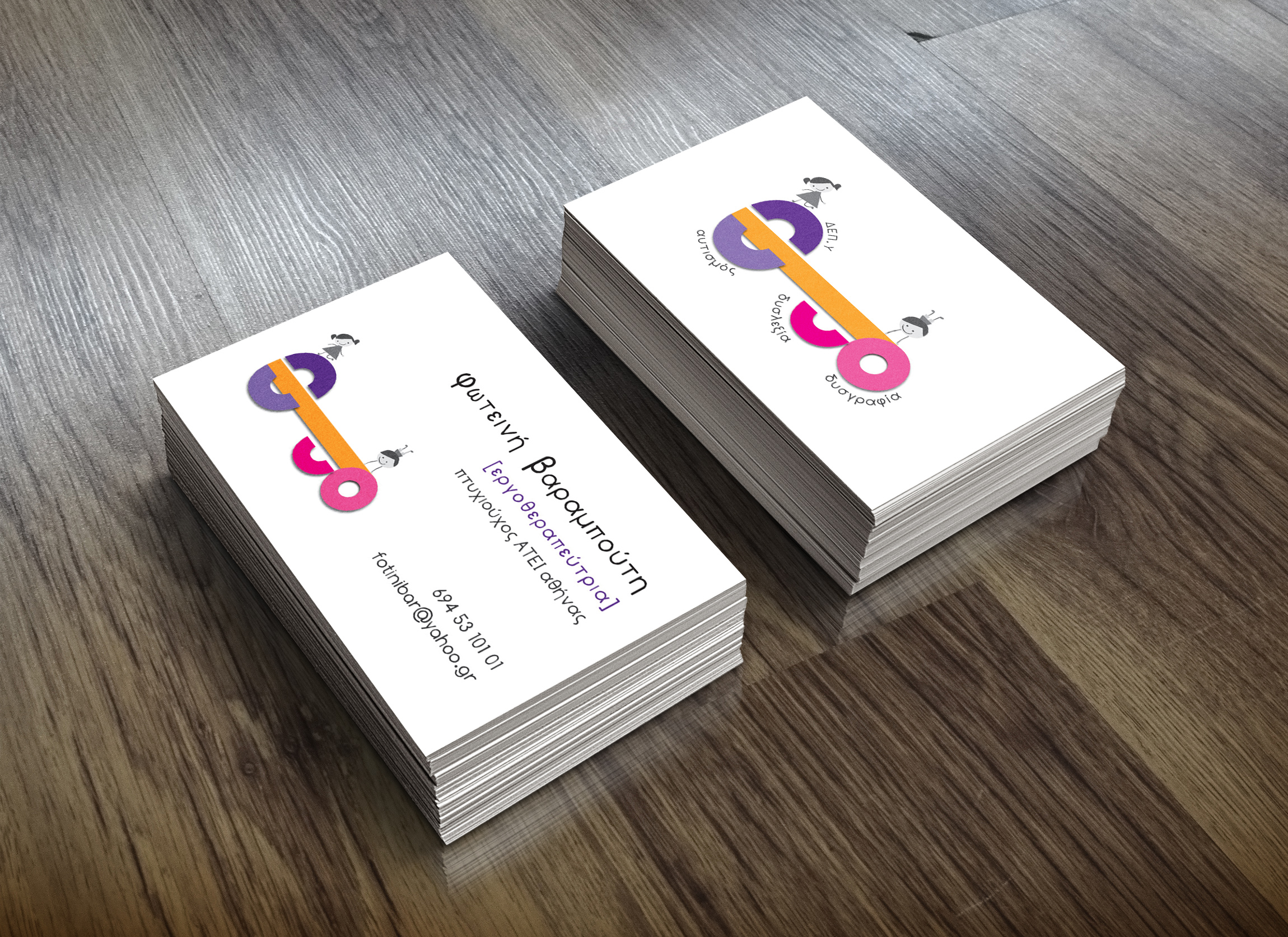
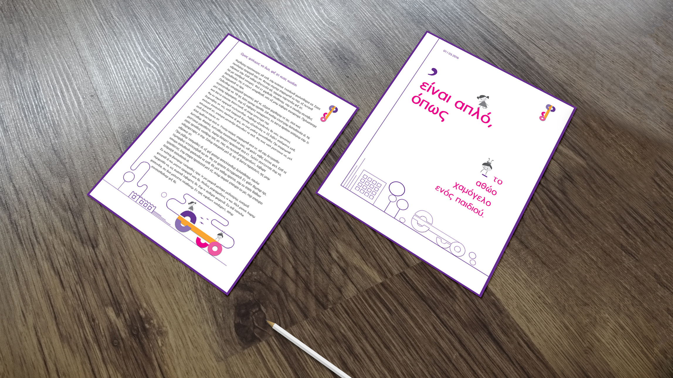
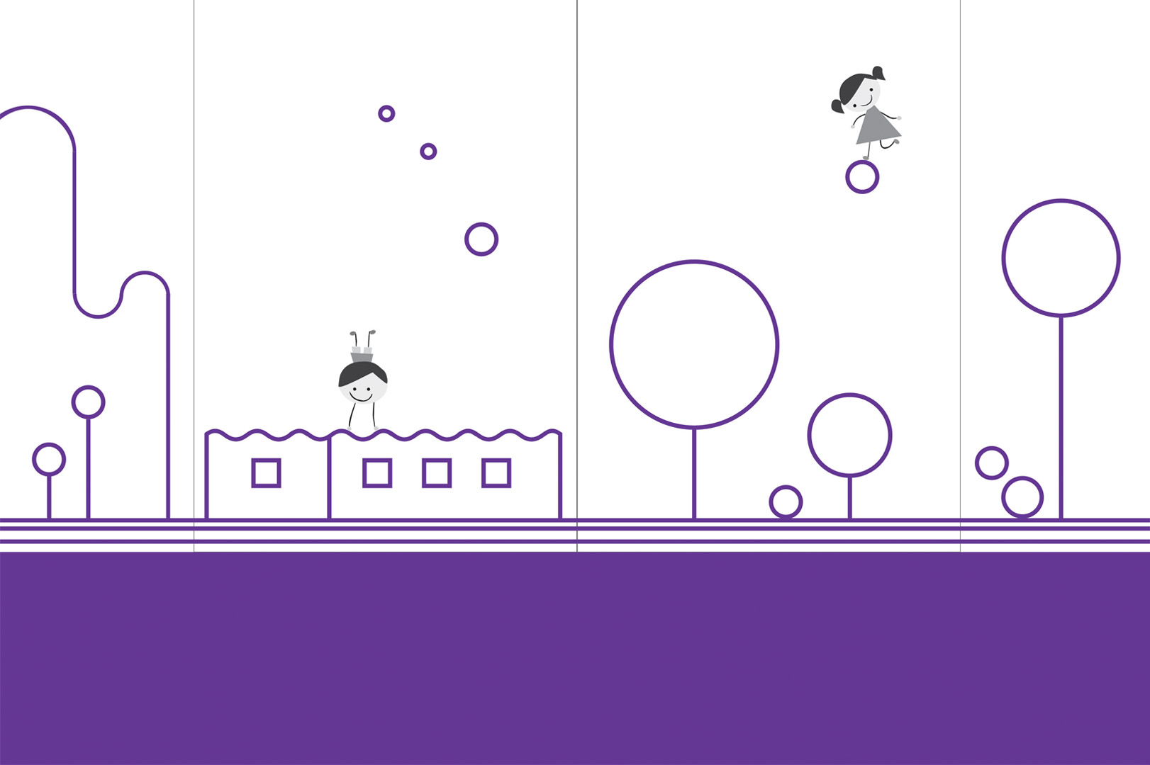
Branding for a children’s occupational therapy center. The project included a logo, secondary logo elements, illustrations, business card production and facade design. Converting the abstract work of the specialized ergotherapist Foteini Varampouti into a logo design that really reflects what she stands for, was quite a challenge. She offers her clients that are especially childs, the first hand in their process to recovery and helps them improve the quality of their life with their unique needs and limitations in mind. To provide a recognizable identity, it had to really stand out and this means the logo should not be, yet another, usual icon.
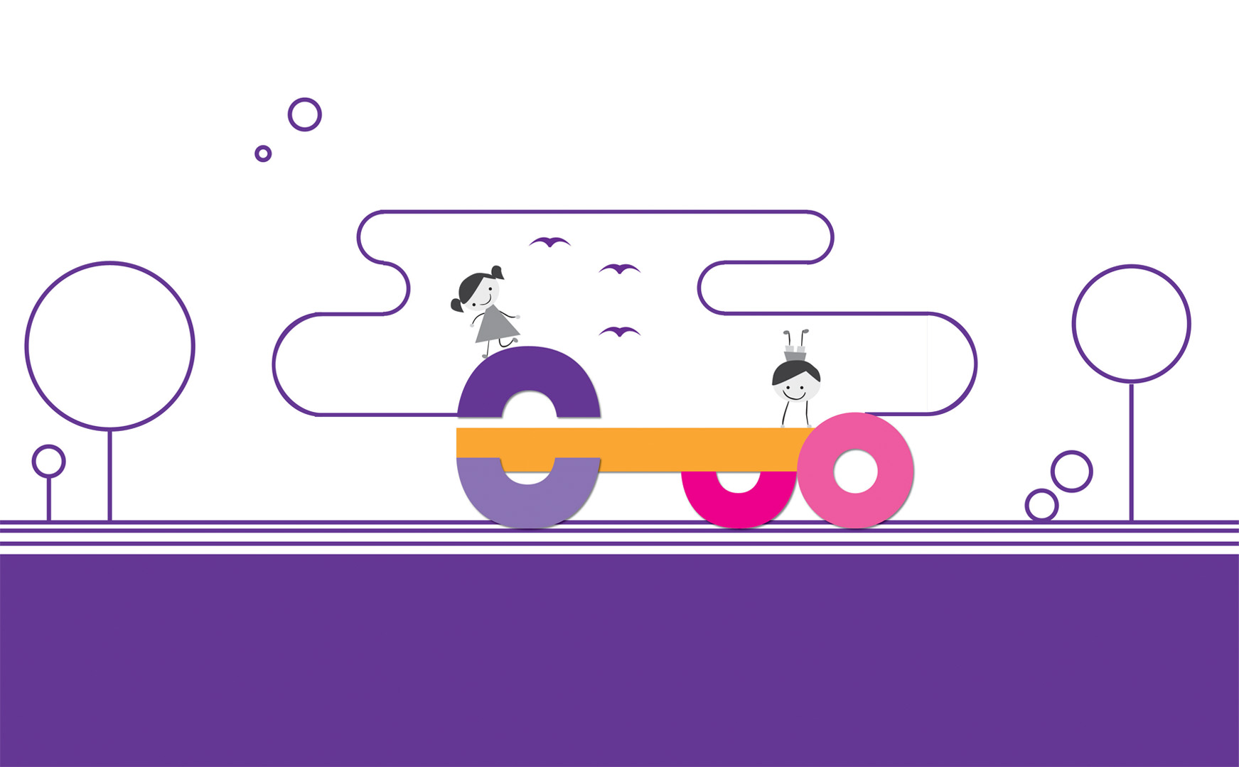
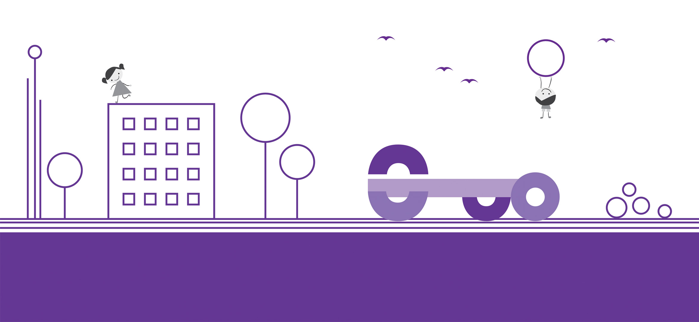
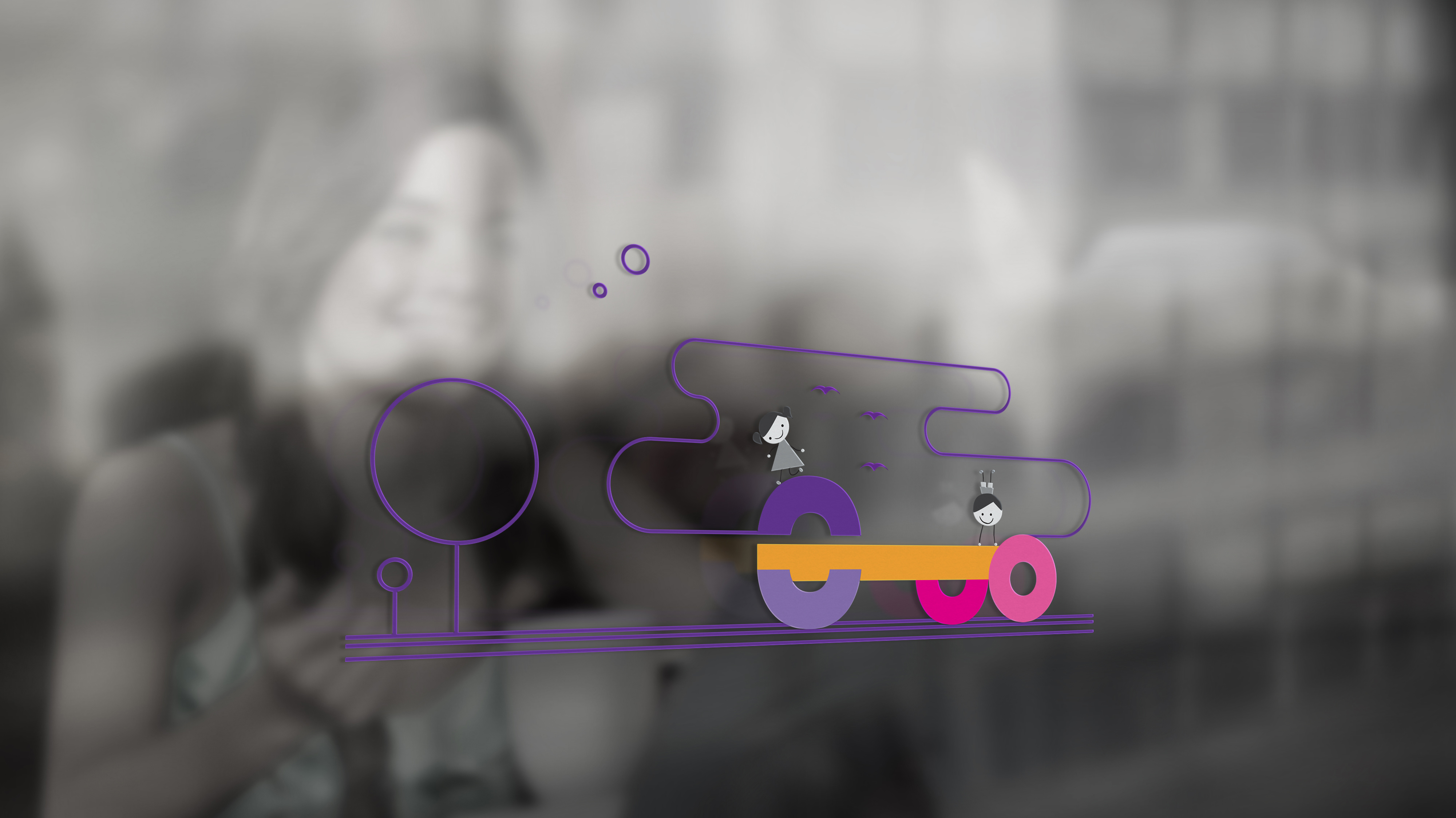
The graphic system was built with five geometric shapes and the owner’s initials. These elements work like a game that are constantly changing, composing finally the logo. Curves and rounded edges are used to signify simplicity and innocence. The logo combining these dynamic geometric elements represents a children’s toy. The task was to create something simple and friendly, in order to motivate those little heroes to improve themselves. The brand color palette adapted for the ΦΒ occupational therapy center focuses on colorful and playful feeling using purple, orange and fuchsia accents. We ended up developing a brand that, although modern, retains a naive feeling through the use of color and illustration style.